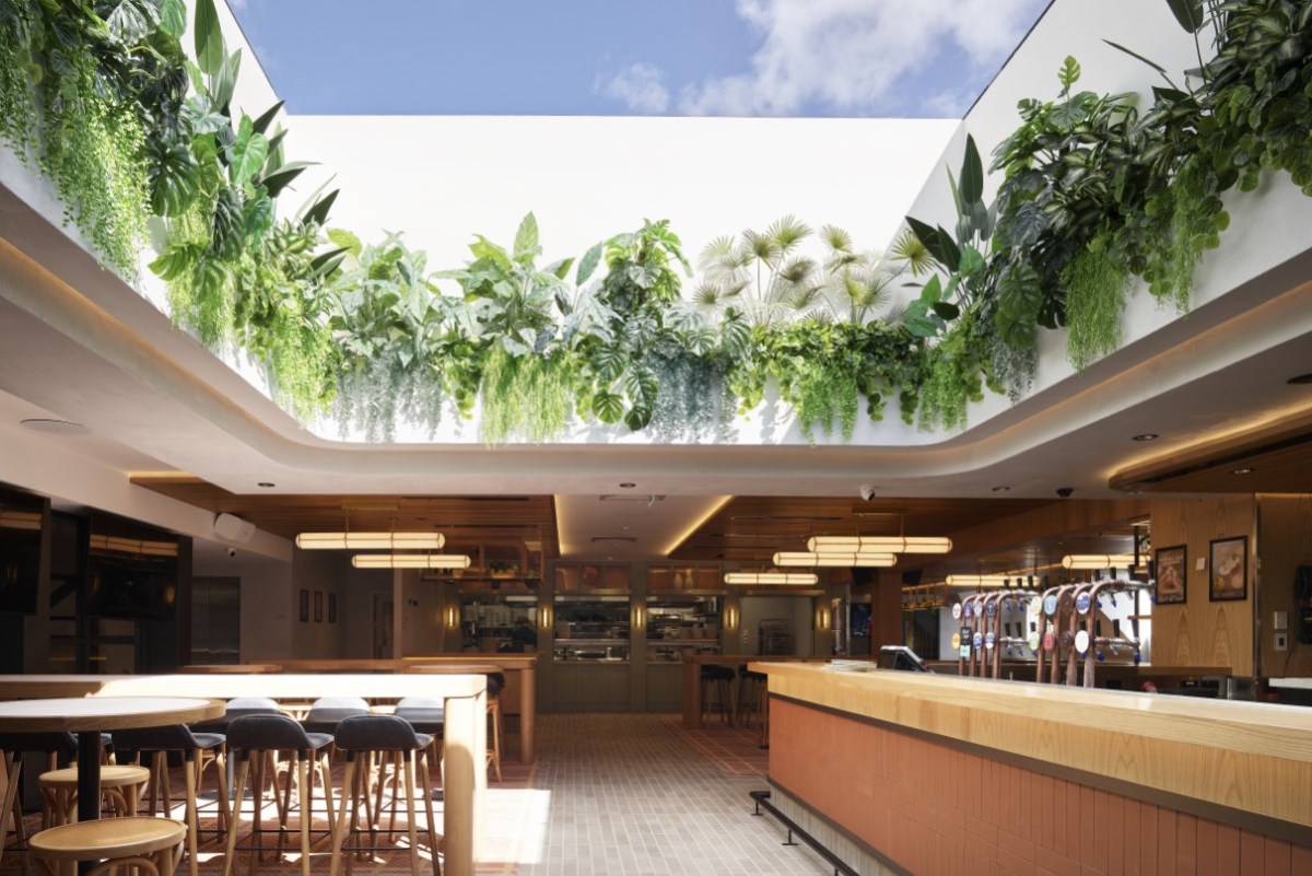
Mermaid Beach Tavern reopened its doors to the public in August after a major project to transform the pub into a more visually striking and inclusive venue for the local community.
The pub was built on a McDonalds site on the Gold Coast Highway in the 1990’s and has continued to operate as a family-friendly venue that for many years retained the iconic McDonalds-style playground out front.
Mermaid Beach Tavern now has a completely new look that includes a striking new façade, large circular skylights and a retractable roof to bring the outdoors inside.
Although its visage and ambience have changed markedly, Mermaid Beach Tavern is still a comfortable, casual and family-friendly pub for the community, according to its owner, JDA Hotels, which is owned and operated by the publican Feros family.
There’s still a spot for the kids to play with a new designated kid’s room, as well as lots more natural sunlight and an elevated food and drink offer.
“It’s been a difficult road with Covid, but we couldn’t be happier with the end result,” Mermaid Beach Tavern’s owner John Feros says.
“Our intent was to offer a great food, drink and customer service experience for everyone in the diverse and vibrant Gold Coast community. That’s what we pride ourselves on as a company and what we plan to execute at Mermaid Beach Tavern.”
According to JDA’s group marketing manager, Merinda Harris, the hotel group identified early on the need for a really well-executed pub offering in the immediate area.
“For that reason, Mermaid Beach Tavern will be a pub first and foremost, and will pride itself on doing the simple things right – great pub food, an extensive beverage offering, good entertainment and fantastic customer service,” she says.
Front and centre
The pub’s new look was designed by Paul Kelly Design. “The fundamental idea was to bring new life to the past, with our concept being a reinterpretation of a jewellery box,” Kelly says.
“The Mermaid Beach Tavern really is a bit of a coastal classic, with a little touch of Gold Coast hype.”
It was important that the venue stand out from the crowd, given its location on a busy and intense streetscape featuring putt-putt golf, garish Chinese restaurants, massive billboards, and other bold elements. For this reason, Kelly says, particular emphasis was given to the pub’s façade.
“In order to stand out, we really had to go for something quite soft and contemporary, and to do this we created a facing detail on the building. That new addition to the façade was something we worked hard on to get some differentiation.”
Want to keep reading? Read the rest of the article below in the December-January issue of Australian Hotelier.

