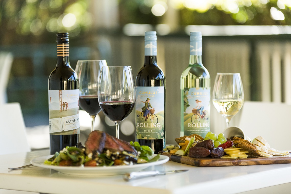
Cumulus Wines has launched a fresh new look for its signature Cumulus Estate Wines brand, with the new packaging rolling out from September.
When its key ranges Rolling and Climbing were first released 15 years ago, their distinctive illustrated packaging stood out. Now with the help of drinks specialist design agency Denomination, Cumulus Estate Wines has been reimagined to capture the unique spirit of the brand and region that it represents.
Cameron Crowley, CEO of Cumulus Wines praised Denomination’s reputation for creating innovative and successful brands.
“Both Rolling and Climbing aim to bring to life the joy of wine and the very special place that gives these wines life – our unique dual appellation vineyard in the beautiful Orange wine region.
“In today’s competitive wine market, it’s more important than ever to increase shelf visibility and consumer attention. Our goal was to retain elements of the original design, but incorporate new illustrations with a vibrant, fresh look to reflect the quality of our wines.
“Denomination has a reputation for creating beautiful, innovative and successful brands and they have yet again delivered on our iconic Cumulus Estate Wines brand.”
Known for its whimsical packaging, Rolling has three new illustrations across the red, white and sparkling varietals. Rolling’s ‘heroine’ character Beatrice features with her faithful dog Cirro exploring the vineyard and the distinct cool climate seasons.
The Climbing labels are inspired by the high elevation of the Orange region. The brand’s ‘hero’ Henry is scaling the heights of the single estate vineyard over 600m with local Mt Canobolas in the background. The newly illustrated wrap label includes an embellished circus ticket with serrated edges honouring the history of the travelling circus in the region and surrounding areas.
The rollout of Rolling and Climbing refreshed packaging commenced September 2018 and continues through to February 2019.

