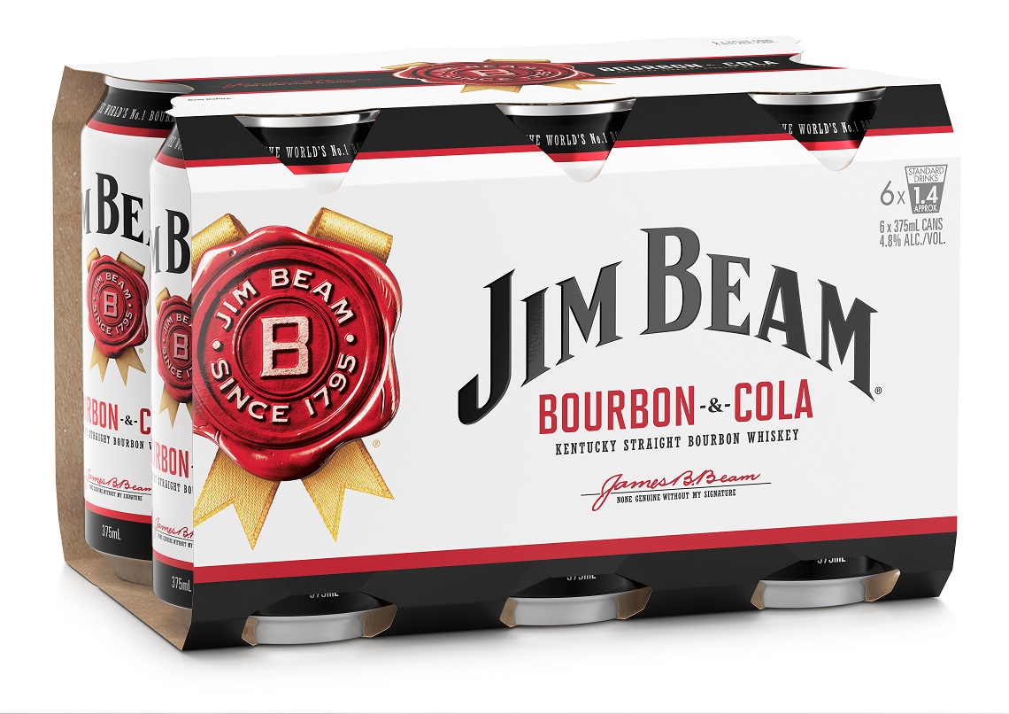
Jim Beam has launched a fresh and modernised new look to the packaging of its ready-to-drink (RTD) portfolio.
The new design gives a distinctively premium look to the entire Jim Beam White and Jim Beam Black range broadening their appeal and amplifying the brand’s position as the world’s number one Bourbon.
The packaging refresh aims to convey the new, modern and sleek visual identity of the Jim Beam RTD portfolio and bring it in line with the quality of the liquid itself.
This is the first major refresh to the Jim Beam brand since a global packaging refresh in 2016 gave the full portfolio of Jim Beam products a premium exterior to “better represent the premium liquid inside”.
Beam Suntory Group Marketing Manager RTD, Stephanie Jericevich, told National Liquor News that the updated packaging of the RTD range would help drive the Jim Beam brand into the future.
“For 225 years Jim Beam has prided itself on going above and beyond to make the world’s number one Bourbon, and we’re thrilled that our new packaging gives the brand a more modern, distinctive and premium look moving forward,” he says.
 The new packaging simplifies the current design allowing increased weighting of the brand’s core assets of the rosette, Jim Beam eyebrow and Jim Beam’s iconic white colour.
“To help consumers navigate through our range, we added a sharper colour coding of the variants and differentiated the layout between our core and high ABV,” says Jericevich.
The additional white space allows the cans and bottles to stand out on shelf versus the category convention of black packaging. And the colour coding puts a greater emphasis on the flavour variants making it easier for consumers to navigate the range.
The new look packaging is available now and has been rolling into market since July. It is also important to note that it is just the outside of the packaging that has been refreshed, the liquid inside the packaging remains unchanged.

