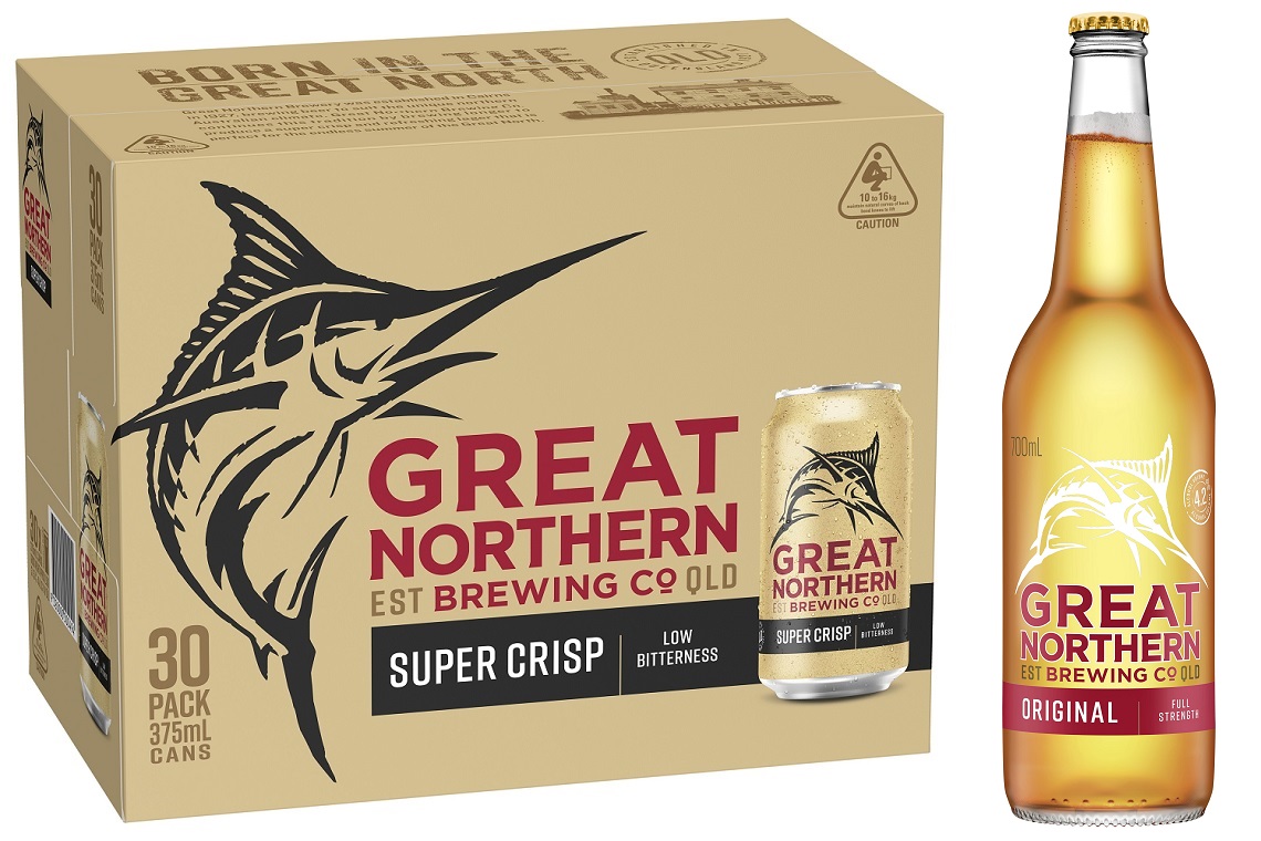
Great Northern Original and Super Crisp has undergone its first brand refresh since it was launched almost nine years ago.
Carlton & United Breweries said the packaging update gives the brand a more contemporary look and would help customers to differentiate between the two products. The brewer was also adamant that while the packaging has changed, the beer remains the same as always.
“The branding might look a little different, but it’s the same great Great Northern. We take a great deal of pride at the brewery in making sure the Great Northern Quality remains of the highest standard,” Yatala brewery plant manager Tom Robinson said.
The changes see the colour of the cans changing from gold to sand and Super Crisp’s labelling now includes the words “low bitterness”.
“Great Northern Super Crisp has always been a less bitter blend,” Robinson added.
“It’s always been a part of the Super Crisp taste profile. We’ve just taken the term out of the brewery and put it on a label.
“We thought it was clever way for customers to recognise Super Crisp and how it is different from our Original brew.
“We know the ‘low bitterness’ taste profile works, because Great Northern Super Crisp has become a popular beer, especially out and about in the great outdoors.”

