Hahn has redesigned its range as the beer aims to evolve a new look which it hopes will “reflect the changing lifestyles of the Australian beer drinker”.
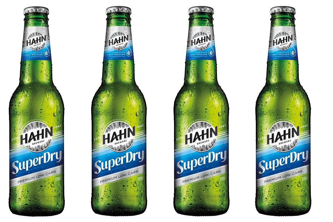
The new packaging includes a green bottle for the entire range as well as a fresh logo and label design, which Portfolio Manager – Contemporary Brands, Marketing, Amy Darvill says is designed to reinforce Hahn’s “great taste”.
“The new green bottle delivers strong refreshment and taste credentials, and is featured front and centre on our new packaging to drive awareness of Hahn’s great taste,” Darvill told TheShout.
“The new packaging designs deliver a more modern, contemporary image for Hahn, and will ensure the brand continues to stay relevant with Australians of today. We’ve also dialled up our low carb message on our packaging- we feel it’s important for consumers to be aware that they can have a great tasting beer, that also happens to have 70 per cent lower carbs than regular beer.”
Darvill said that one of the key reasons behind the change was to fuel the growth of the contemporary beer segment, “by refreshing Hahn to unlock greater appeal among a wider audience”.
Retailers will have seen the green bottle and new packaging hitting stores from April and Tracey told TheShout that Lion has support for retailers to go with the redesign.
“The brand restage will be strongly supported in trade to ensure consumers are aware of Hahn’s new look. This includes full POS suites for independent customers, featuring a ‘same great taste, fresh new look’ message,” she said.