New Zealand winery Villa Maria has unveiled its premium new look, set to start rolling out across its portfolio next month.
The winemaker has said the changes in the redesign are ‘extensive but evolutionary’, intended to reflect the brand’s 60 year heritage.
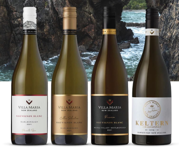
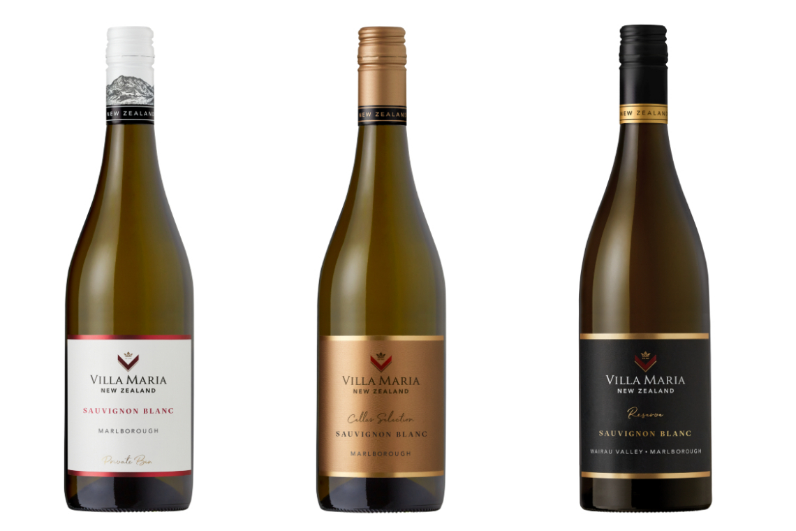
Changes include a subtly revised but more easily recognisable logo, bolder fonts, a reconsidered hierarchy of information, a smaller label, darker glass, and changed colours and tones across different ranges.
Sarah Szegota, Head of Marketing and Communications at Villa Maria, said: “After extensive consumer research we are delighted to roll-out new elegant and contemporary packaging for the Villa Maria Private Bin, Cellar Selection and Reserve ranges. The new look enables loyal customers to recognise our trusted brand and exceptional wines, whilst attracting a new customer and inspiring them to add Villa Maria to their buying repertoire.
“By putting consumers at the heart of our decision making we have landed with a more contemporary look across our Private Bin, Cellar Selection and Reserve ranges that is engaging and aspirational, while still acknowledging Villa Maria’s heritage and long-standing commitment to producing award winning wines.”
The new design as a whole has been informed by in-depth global consumer research conducted by Lumaten, which combined immersive virtual reality with cognitive psychology to identify the packaging designs which most appealed to shoppers. Villa Maria is the only winery in Australasia that has utilised Lumaten’s SHOPPER360 research technology.
CEO and Co-founder of Lumaten, Paul Fitzgerald said, “We are very proud to have partnered with Villa Maria in providing support in the refresh of the labels for their award-winning wines.”
Some of the specific things that the Lumaten research helped develop includes the bolder stroke of the recognisable ‘V’ in the branding, for improve legibility and a more contemporary feel, the hierarchy of information more in line with the wine varietal and region for easier reading and more connection to the logo, and a smaller label for a more modern appearance.
The new look will start being rolled out across the portfolio next month, beginning with the Private Bin range. Some of the changes that apply to this range in particular include a more white and fresh backdrop to the Private Bin label, and a screwcap which pays homage to the New Zealand mountain ranges and scenery with a more prominent and sophisticated monochrome style and striking finish.
The Private Bin rollout will be closely followed by the Cellar Collection and Reserve ranges, which both have benefitted from increased lustre in the fold on their labels.