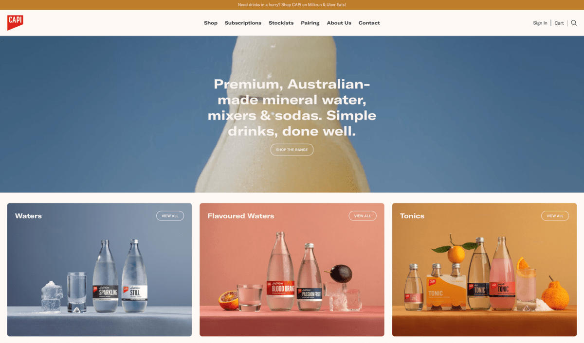
Capi has launched its new website, aiming to benefit both consumers and wholesalers with improved user experience and greater accessibility.
Capi worked with graphic designer Thomas Williams and Australian web developer Zann St Pierre on the website. It includes new features such as streamlined navigation, improved access to product information, and an easy directory of Capi product retailers.
Capi Marketing Manager, Lucy Deitz, spoke positively about Williams’s and St Pierre’s work.
“The collaboration with Thomas Williams and Zann St Pierre has been instrumental in realising our vision for a digital experience that exceeds expectations. Their expertise and dedication have enabled us to not only enhance the functionality and aesthetics of our website but also future-proof our online presence as we continue to expand and innovate,” she said.
The stockist page is central to the website redesign, which allows consumers to locate nearby stores stocking their preferred Capi products. Additionally, the website features a FAQ section tailored to each product, as well as a centralised FAQ page and contact enquiries page. With these pages, users can quickly locate relevant information or submit inquiries via an optimised enquiry form, categorised by specific areas of interest.
The redesign also aims to create visually engaging and content-rich product pages. These now include a sub-navigation feature that activates as users scroll down the page, allowing users to access desired information with a single click.

