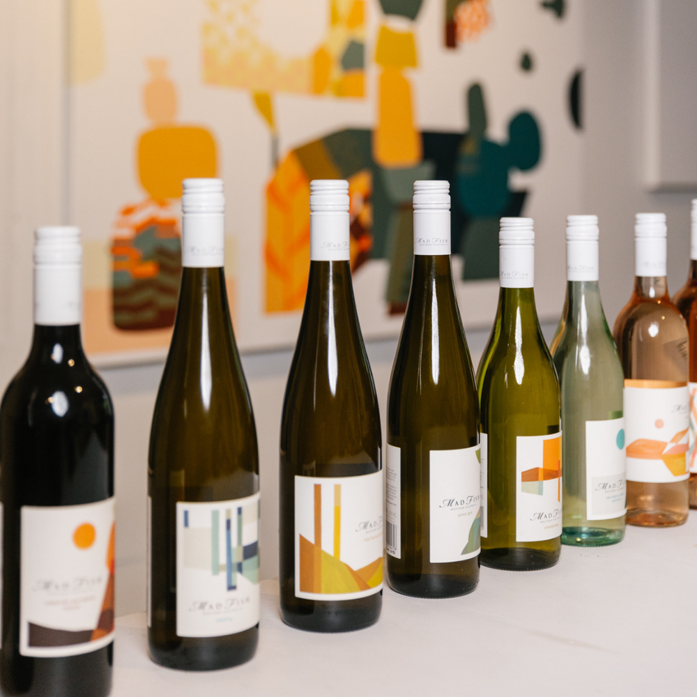
MadFish Wines is bringing art and wine together with its uniquely refreshed labels, the first change in 30 years after the last label art iteration by First Nations artist, Maxine Fumagalli. The refreshed label, designed by South West multi-disciplinary visual artist Kyle Hughes-Odgers, signifies a new visual direction and evolution of the brand, but one that retains the MadFish values and tradition of authentically celebrating the work of local artists.
“We’ve opted for beautiful design-led label artwork, and we’ve chosen a high-profile local WA artist to further drive home the core brand value of choosing local,” said Natalie Burch, General Manager and Marketing Director at Burch Family Wines in WA which owns MadFish.
Other core values of MadFish that are symbolised in the new label are centred on simplicity, joy and positivity. This is in addition to a range of principles that will entice new consumer groups to the brand, including the continued fundamental quality of the wine.
“The new labels widen our brand appeal to the younger generations, Millennials and Gen Zs. Appealing to these consumers is vital to our success as a business… by 2026, Gen Z and Millennials will be our core consumer groups, making up 49 per cent of the drinking population. Two key statistics that stand out for us, is that 58 per cent of Millennials choose a wine or beer solely based on the packaging, and 90 per cent of Millennials would switch brands to one associated with a cause they believe in,” Burch said.
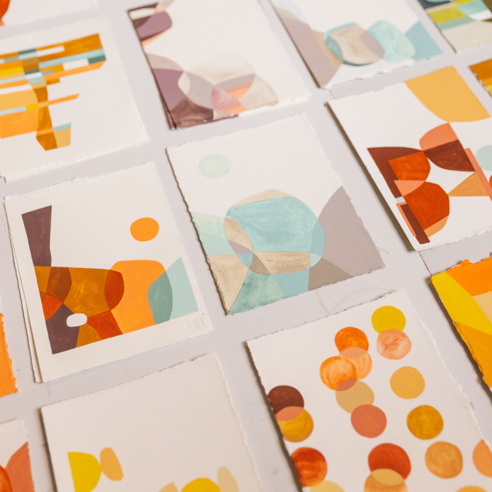
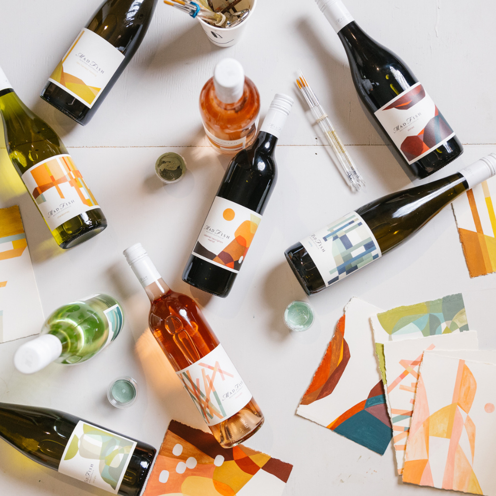
Since its inception in 1992, MadFish has been embedded in the culture of the South West so its collaboration with local artist Kyle Hughes-Odgers is a fitting one. Hughes-Odgers is well known for creating large scale visual murals in cities around the world, with much of his work inspired by nature and expressed through colourful lines and bold shapes. His design for the new-look MadFish range features abstract interpretations of the region’s landscape which is brought to life through Hughes-Odgers’ signature style and a colour palette that reflects both land and sea.
“I created over 30 abstract paintings based on photographs I took around the Margaret River region and the winery. From these 30 images the final 13 were selected. I did this as I wanted the works to be non-literal but based on landscapes connected to the south west and around the winery.” says Kyle Hughes-Odgers of his design process. The 13 final designs were selected to match each wine variety in the MadFish range. The work is then printed on a lightly textured white label stock and finished with MadFish Wines’ distinct script logo. The varietal is printed in a matching colour scheme to the artwork, connecting the artwork through the entire label.